Center for Energy and Environment
Different audiences. Different needs. One site.


Serving many audiences
CEE offers energy saving services to many distinct groups. From homeowners to cities to engineers to utilities, we helped identify CEE's main site visitors and each audience's unique needs. We imagined a structure that quickly and effectively connected them to information and action.
We also moved away from internal, branded lingo. Now, services are clear to newcomers and returning visitors alike.

Clear & easy design
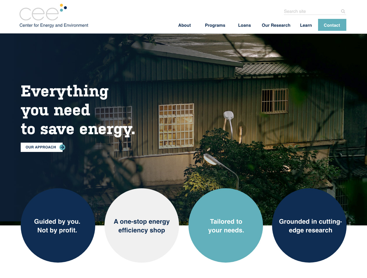
The experience of working with CEE inspired the design and layout—clear, easy and approachable. The color palette is focused and friendly. Lines are crisp. Pages are visual, short and easy to scan. The new design captures the clearcut professionalism and helpfulness that CEE embodies as an organization.
what we did
Presenting complex data simply
Despite its simple appearance, the backend of CEE's website is a workhorse. Loan program rates and payments are calculated on the fly. City-specific pages dynamically feed in current program information. And, CEE staff can quickly spin up uniquely branded microsites for their frequent partner programs.
users know where to go
The site's architecture and messaging overhaul has been a great success. Users are finding what they need and traffic has increased year over year.
staff can do more
Projects that used to require coding and development can now be easily managed by CEE's internal team.
A cohesive story
CEE offers many programs, but their new site has clarity and focus. Site visitors quickly understand that CEE has "everything you need to save energy".
