Save the Boundary Waters
Speaking loudly for a quiet place.
Growing a campaign
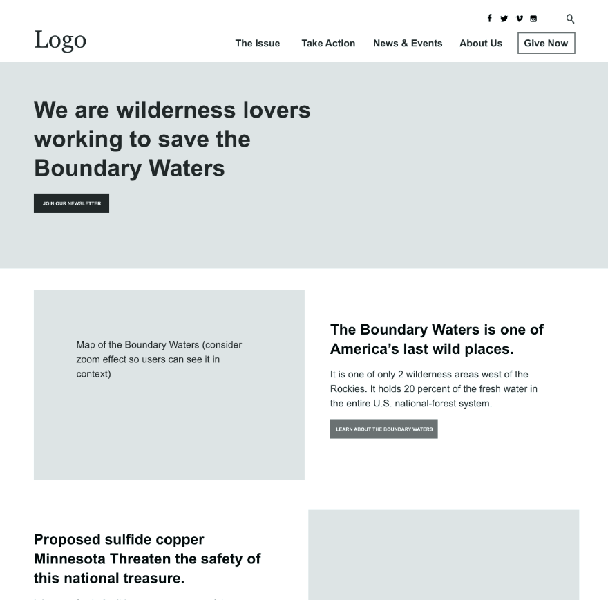
We have been working with the campaign to Save the Boundary Waters since they began. In 2022, we launched a refresh of their site. The campaign had grown leaps and bounds since their inception. They needed a site that better showcased their knowledge, efforts and tireless work.
Designing for action
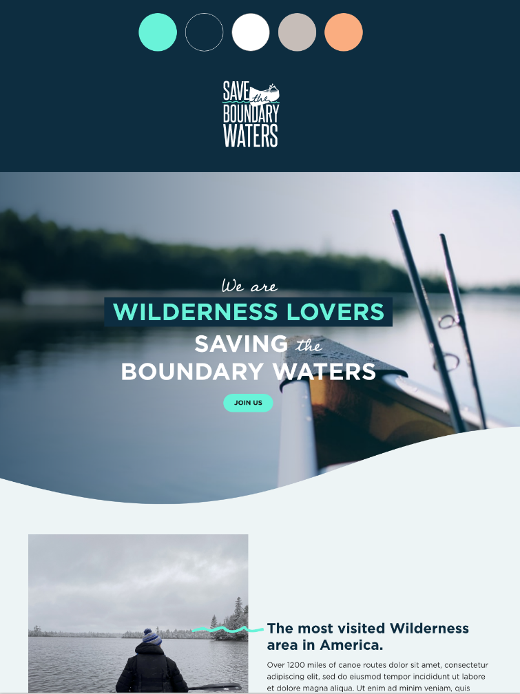
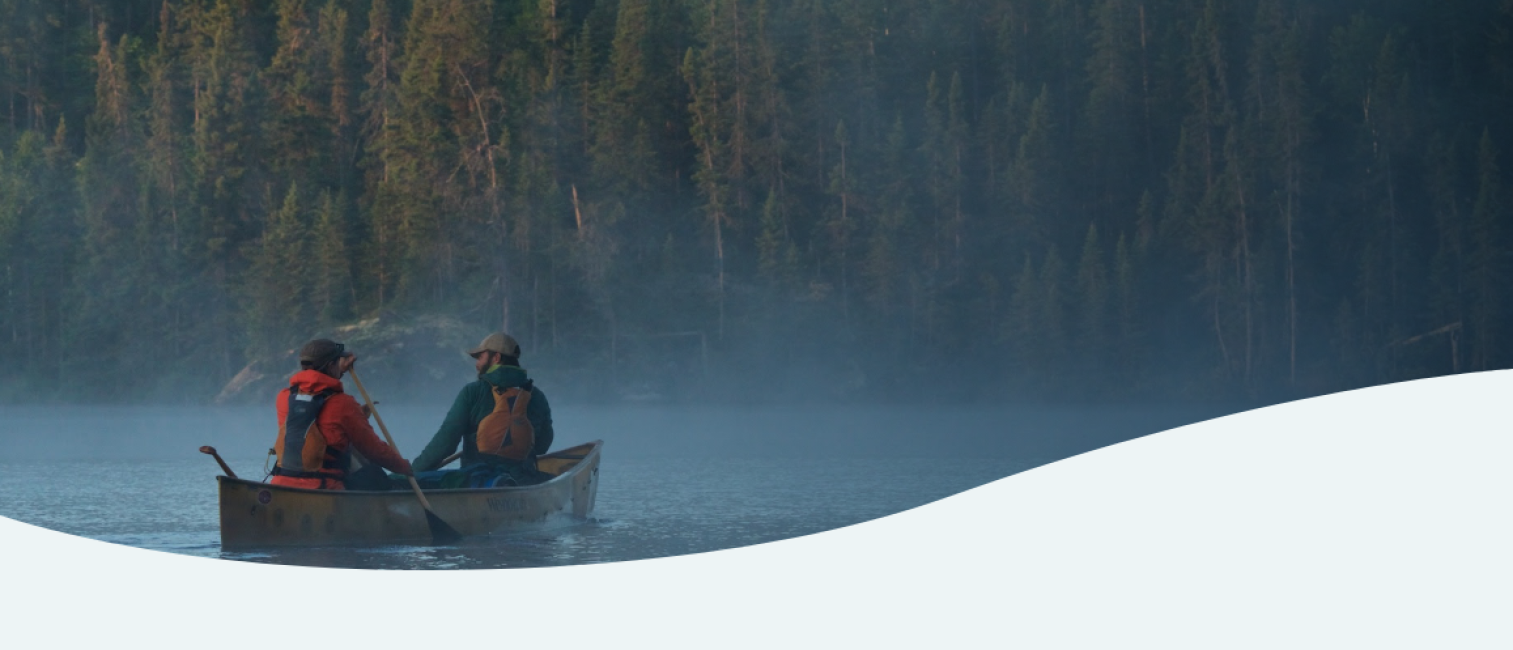
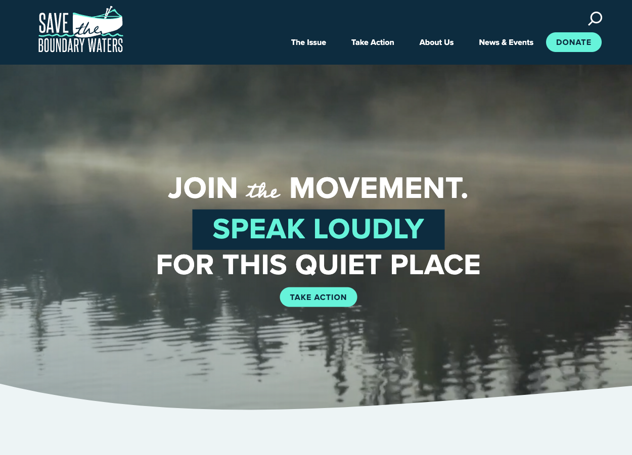
The new site is clean, modern and spurs action at every turn. Every page has a clear purpose and call to action. The navigation is action-oriented. And, subtle animation techniques, such as the homepage wave, compel emotion and highlight action.
The color palette also helps the campaign's brand stand out and makes site actions quickly discernible. Neon teal against placid photography contrasts the tranquility of the Boundary Waters with the urgent need to act on its behalf.
what we did
More users. Less distractions.
In the months after launch, engagement was up and users had increased by almost 20%. The site now handles vast content needs–everything from scientific reports to campaign updates–without bogging down users who want to take immediate action.
Streamlined Resources
We aggregated all the campaign resources, such as policy and scientific papers in a robust resource library that is easily searchable and filterable.
Integrated Forms
We integrated with EveryAction, so donations and petitions look seamless within the site, and it's easy for administrators to spin up new ones.
A Memorable Brand
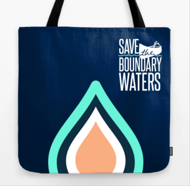
Although the project focused on the digital brand, the changes we made were extended to all communications–from billboards to newsletters.
