Volunteers of America
The help people need, now.

Simplifying services
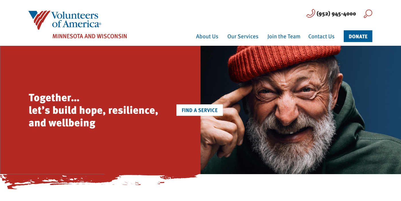
Volunteers of America of MN & WI came to us with an overwhelming amount of offerings paired with a desire to quickly connect people to help. The challenge was to highlight the breadth of their services without creating barriers to immediate help.
Built around data
Research and data led this redesign. We combed through thousands of pages, examined usage patterns and interviewed staff to find users' top needs.
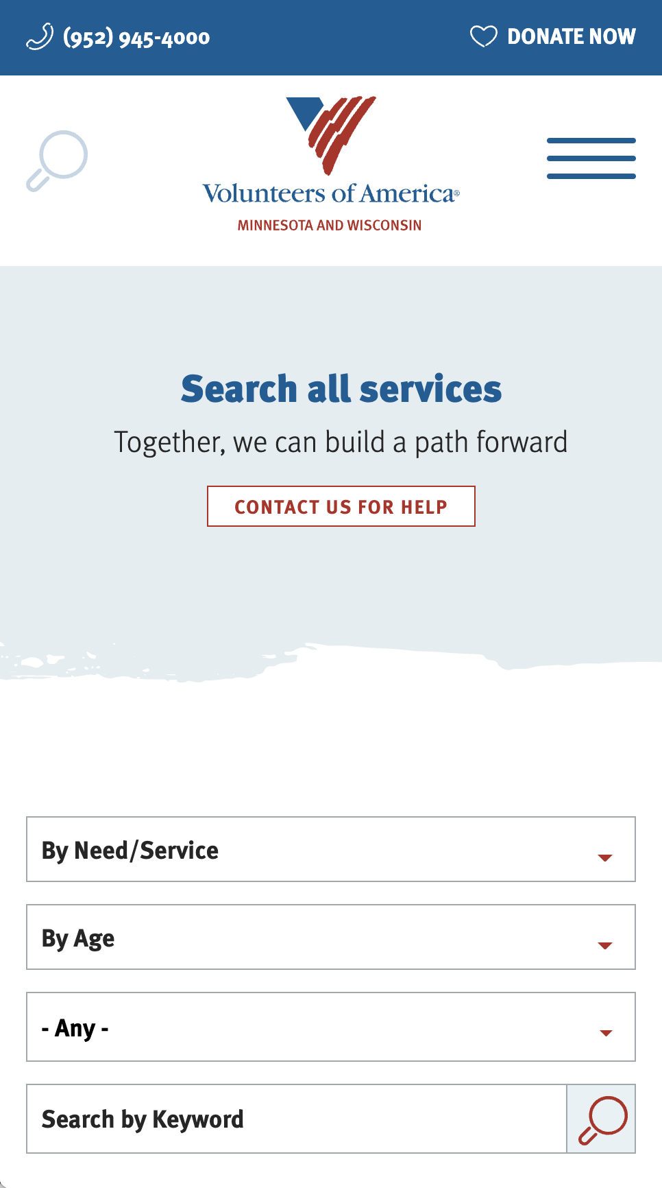
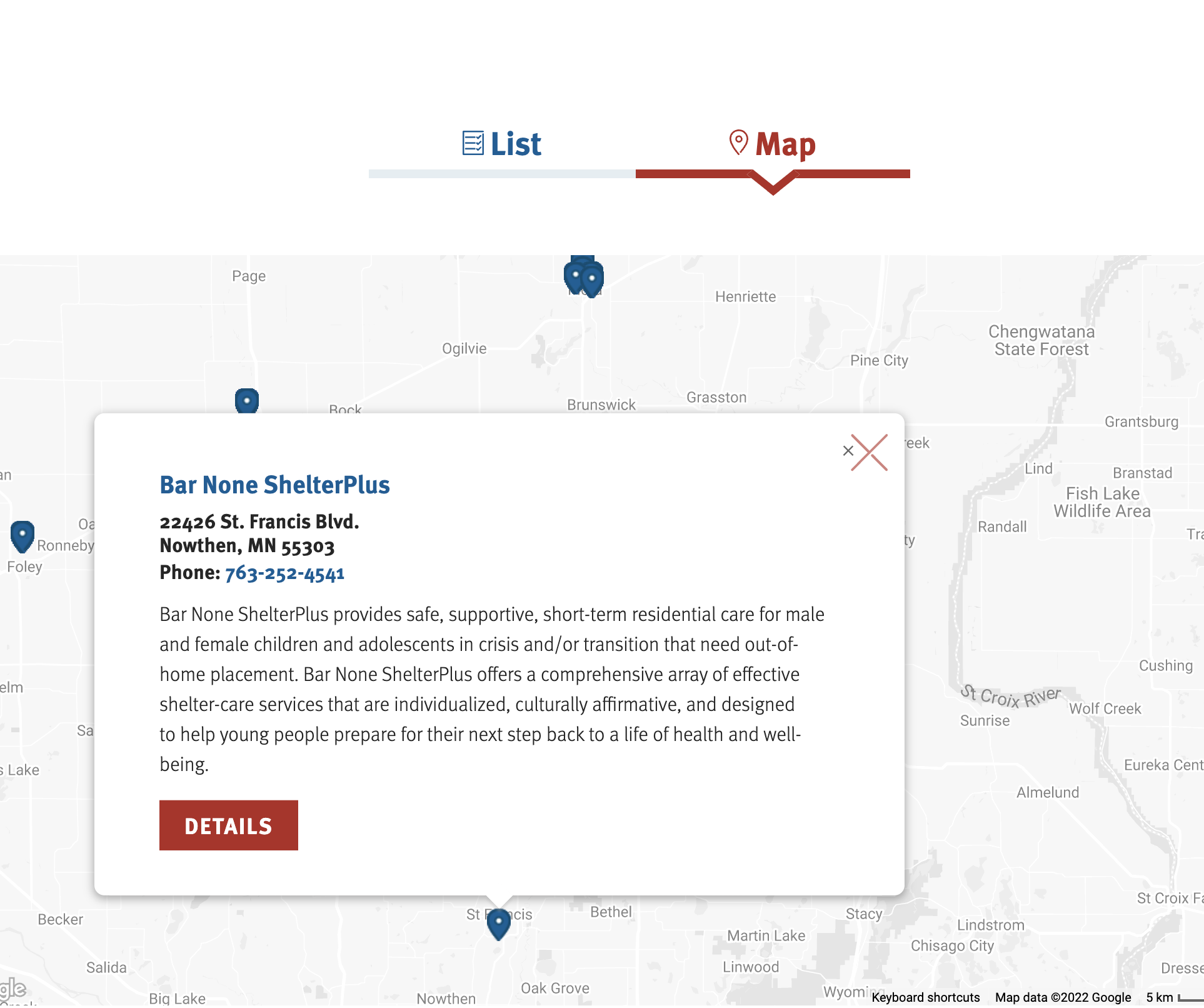
The resulting menu exposes VOA's most-sought-after offerings. Services are organized by audience to increase scannability. Service names were simplified, using keyword data and staff input to match user intent. And, we created a robust service search, so visitors with particular needs can find their perfect match.
what we did
Consistent. Concise.
The content throughout the site is now simple and intuitive to scan. The consistent structures added throughout the site help users understand content. Consistency also helps search engines better understand what VOA does, which in turn gets more people to the help they need.
A deep dive into content strategy
From content audits to writing, we helped guide every page of this site's creation.
A robust service search
We created a service database that made service information both consistent and filterable across the organization.
A brand refresh
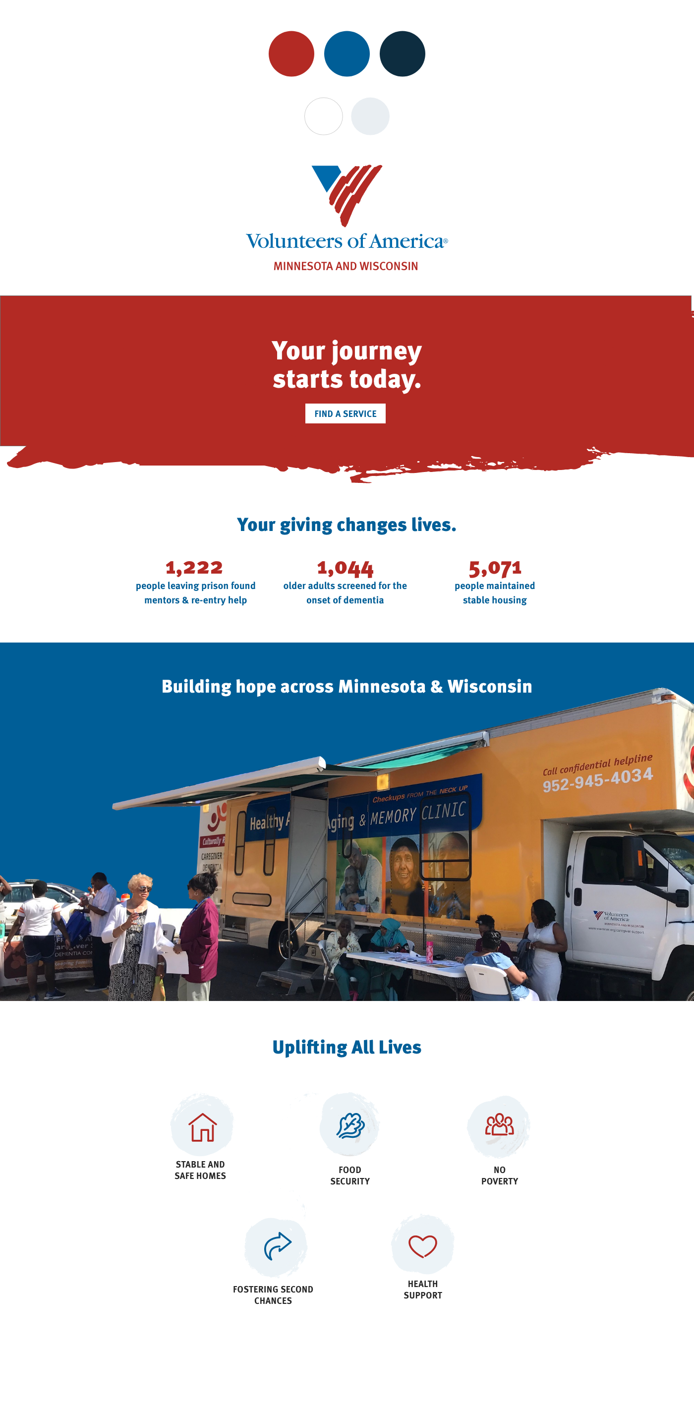
We worked within the national organization's color and typography palette to create a look, that was related, but unique for Minnesota & Wisconsin.
